Overview
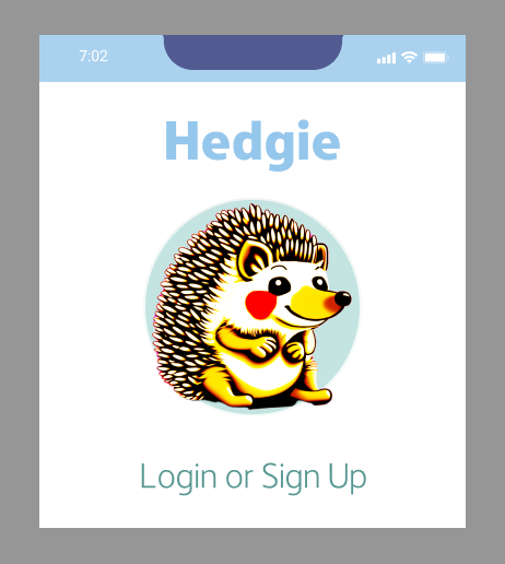
Hedgie is a unified messaging app designed to address the growing challenges of communication across multiple platforms. Created with users like Sandra—a mid-level project manager overwhelmed by digital clutter and app-switching—Hedgie integrates diverse communication channels into a single, intuitive workspace. By leveraging user research, iterative design, and emotional considerations, Hedgie aims to reduce cognitive overload and make multi-channel communication seamless and enjoyable.
Problem Statement
Sandra’s day-to-day tasks involve juggling multiple messaging platforms to stay connected with colleagues, friends, and family. This context-switching consumes an average of 36 minutes daily and disrupts focus, taking up to 9.5 minutes to regain. Beyond time wastage, this fragmented experience contributes to cognitive overload, frustration, and self-doubt.
The core problem:
How might we make recalling and managing text messages across multiple sources easier?
Design Process
Research
“This is what I’ve got to do … I’m just used it it” -Jordan, Interviewee
User Research
Conducted interviews with three individuals using 4+ messaging platforms for 50+ hours weekly.
Participants expressed:
- Frustration with inefficient search methods and disorganized notifications.
- Apprehension about making mistakes or missing important messages.
- Persistent feelings of distraction and disorganization.
Secondary Research
Explored cognitive psychology, market trends, and technical solutions like iPaaS and Unified Workspaces.
Key findings:
- 45% of knowledge workers report reduced productivity due to context switching.
- Cognitive overload—the inability to process excessive information—is a primary cause of inefficiency.
43%
of knowledge workers find it very tiring to switch between tools and channels, leading to missed deadlines, wasted time on duplicate work, and loss of focus
Discovery
Market Analysis: Assessed competitors like Shift, Workona, and Allo. While effective for businesses, these tools neglect personal communication needs. Hedgie’s unique focus on end-user requirements provided a competitive edge.
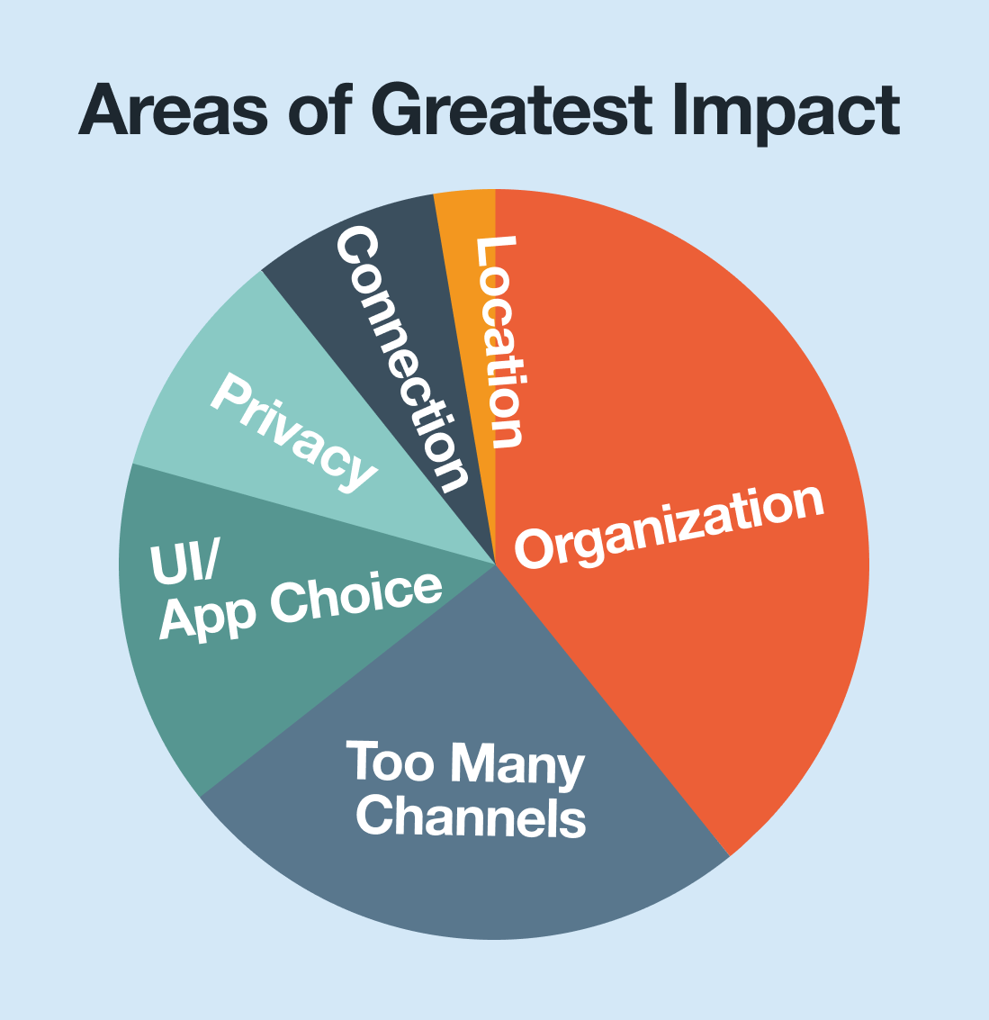
Insights: Users desire:
- Consolidated message threads.
- Simple and intuitive interfaces.
- Tools that reduce distractions without sacrificing functionality.
Ideation
How Might We Statements:
- How might we instill confidence that users will see their messages in a timely manner?
- How might we make communicating through multiple channels enjoyable?
- How might we make recalling text messages feel like an efficient use of time?
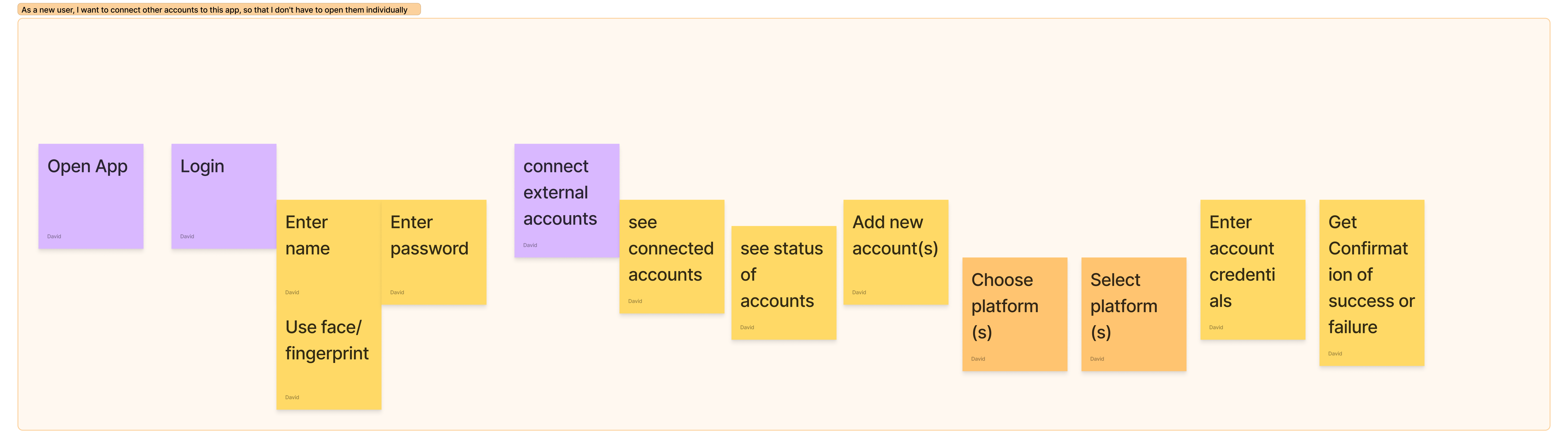
Thought Experiments: Conducted scenarios such as “How would Sandra interact at a party?” to simulate message prioritization and recall, guiding design principles for social and emotional considerations.
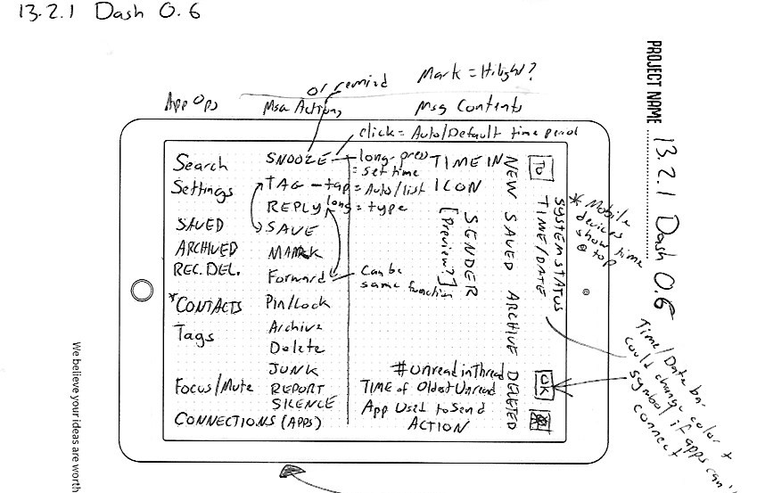
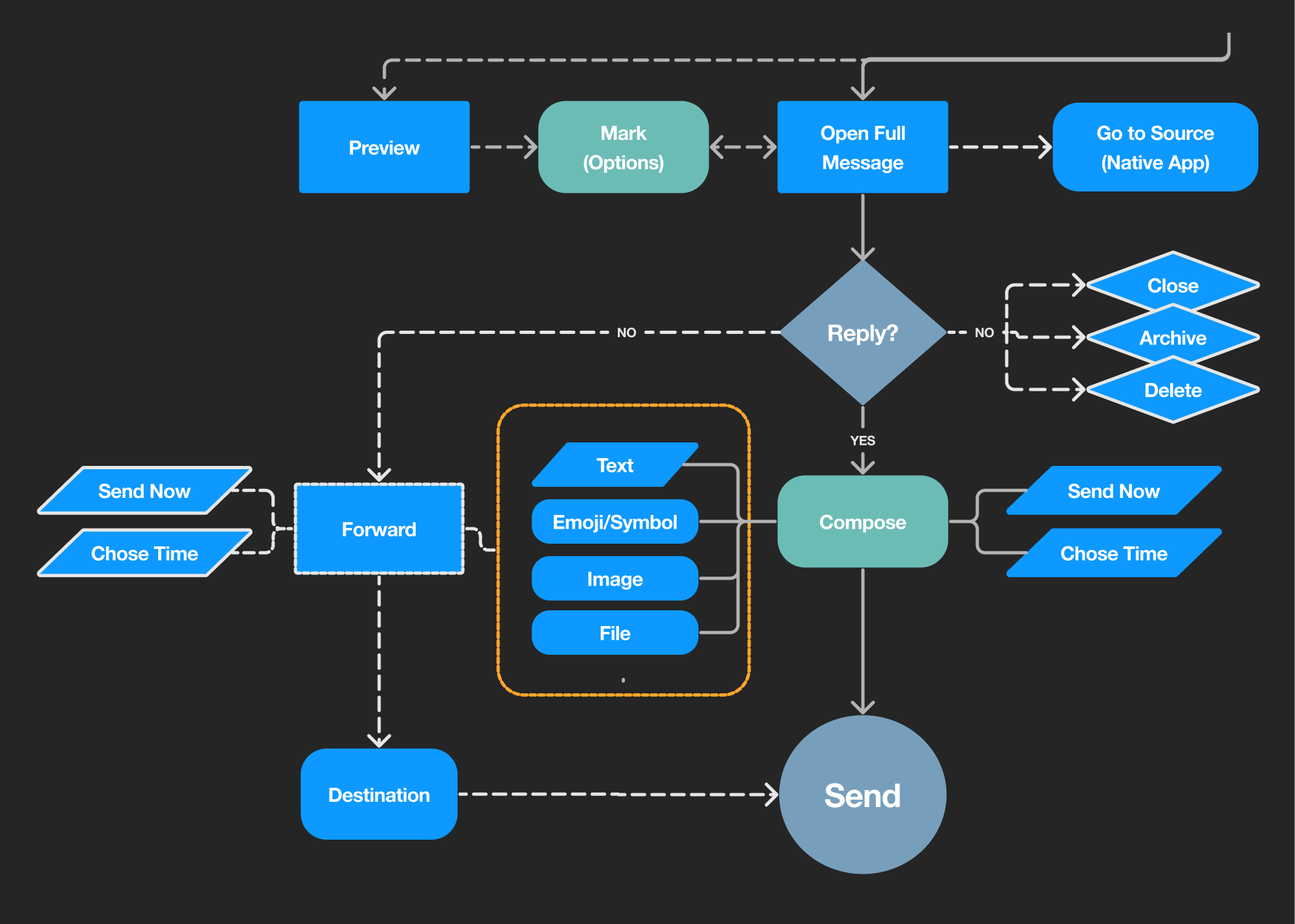
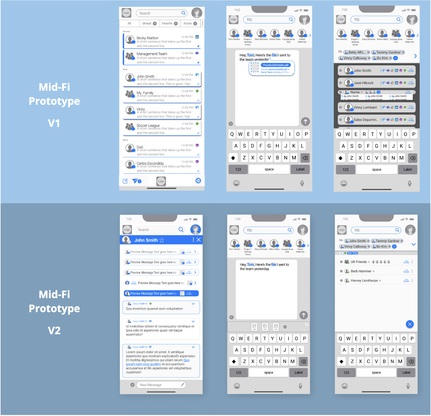
Design, Testing, and Iteration
Prototypes:
- Paper mockups tested with guerilla-style recruitment in public spaces.
- Iterations included dashboards with filterable lists, streamlined user flows, and annotated messages.
User Feedback:
- Positive reception for the intuitive navigation and calming interface.
- Popular features included:
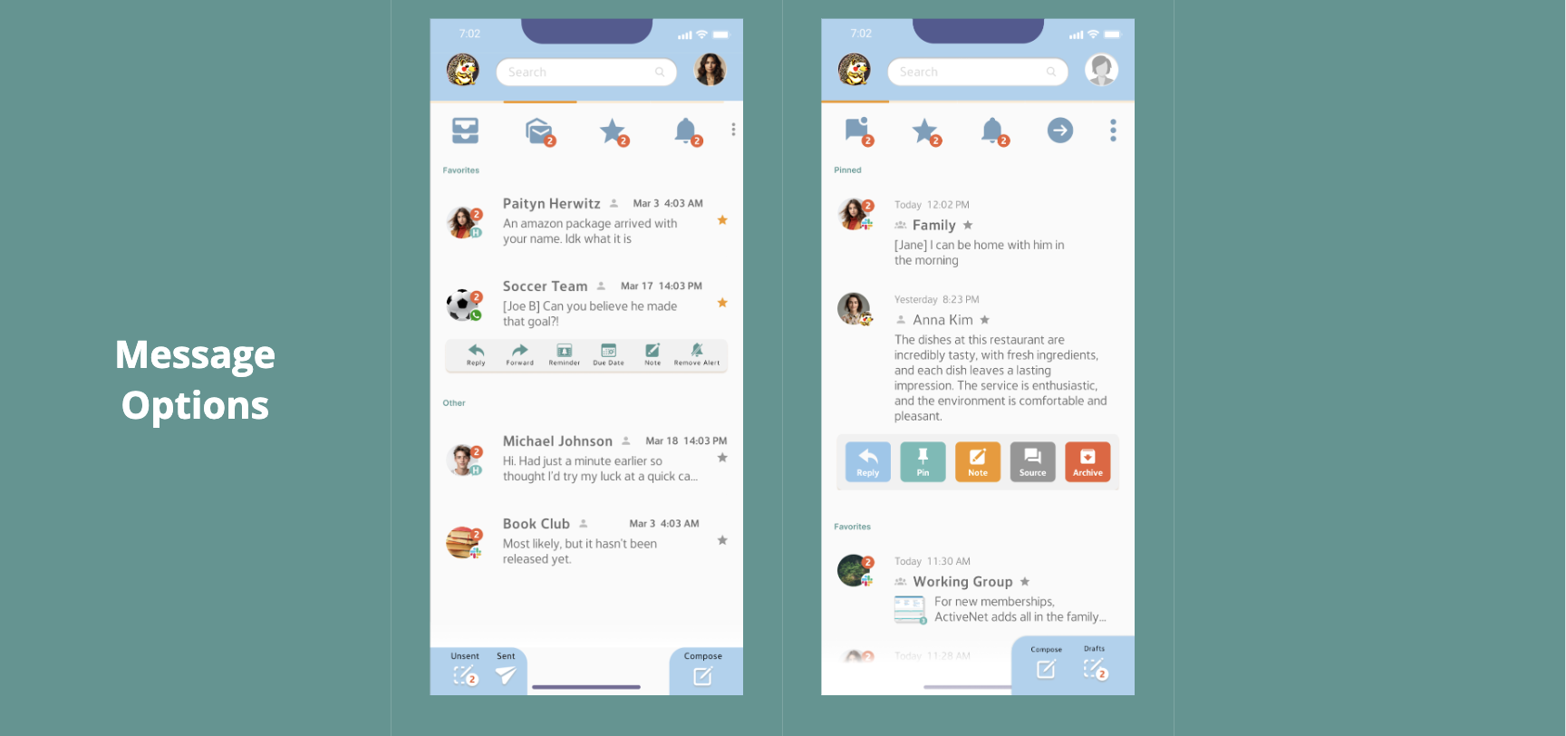
- Icons indicating the source app for messages.
- In-situ notes, tags, and reminders enhancing searchability.
- AI-powered suggestions for attachments and recipients.
- Disliked features, such as intra-app group messages, were removed.
Visual Design:
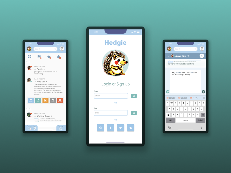
- Adopted a warm and inviting aesthetic inspired by mental health apps.
- Iterated on color palettes to achieve a balance between familiarity and uniqueness, resulting in turquoise and blue tones.
Solution
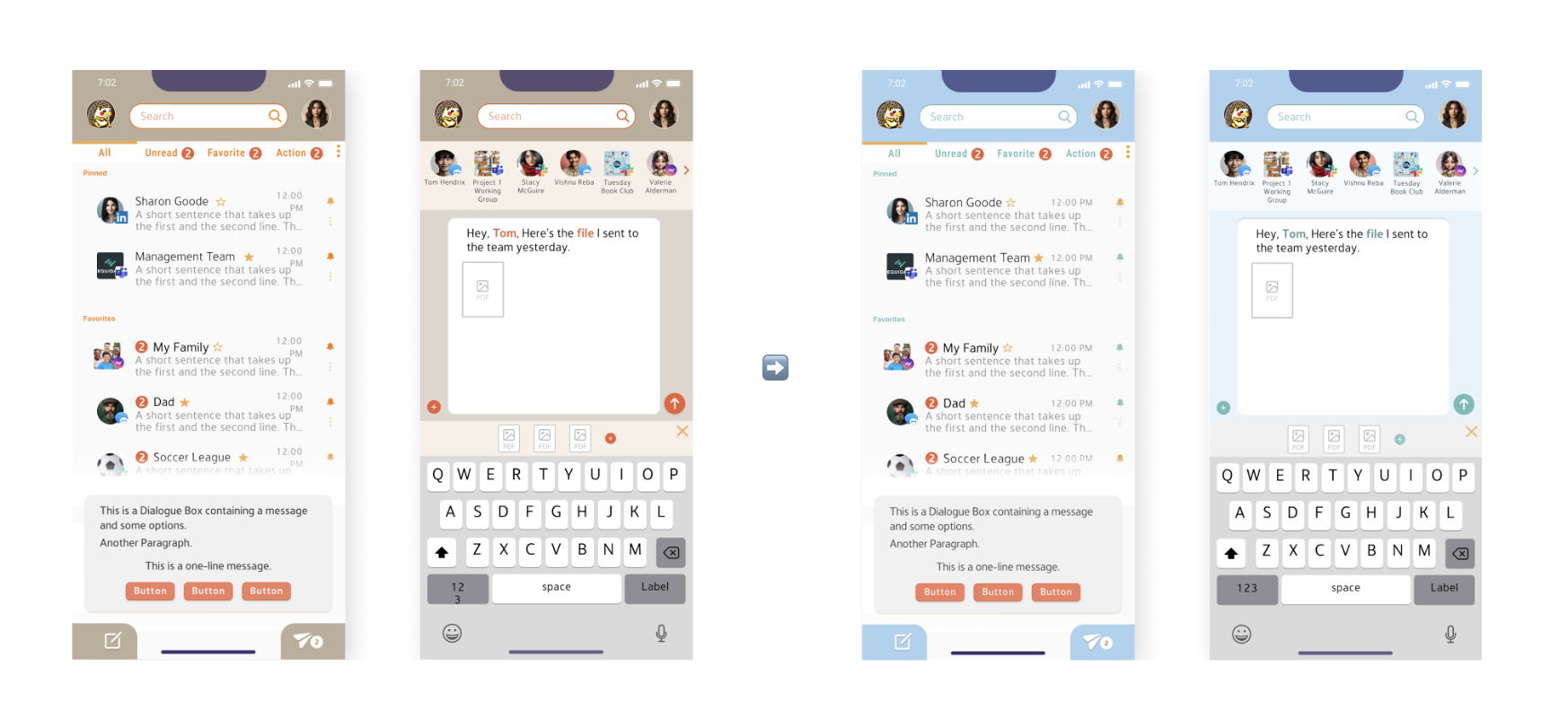
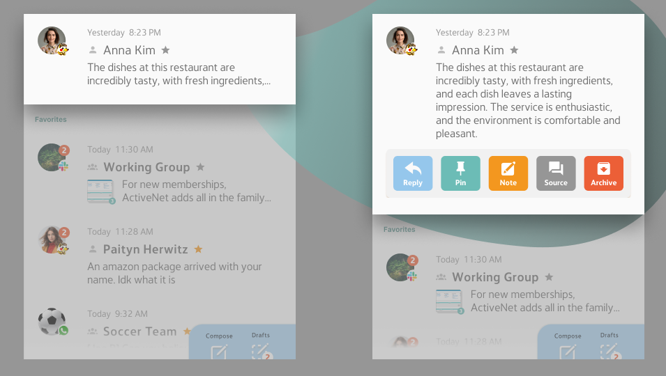
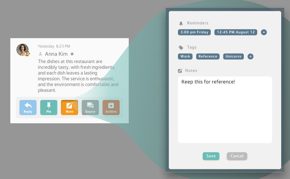
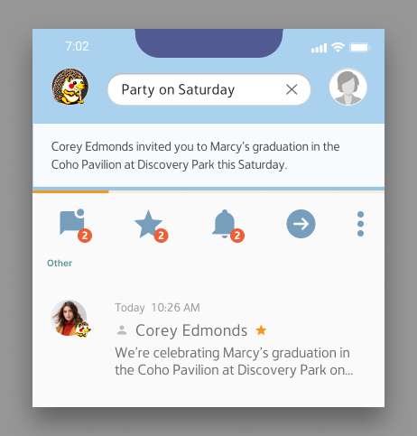
Hedgie consolidates messages from various platforms into a unified, filterable dashboard.
Key features include:
- Source Indicators: Visual cues identify the originating app.
- In-Situ Message Viewer: Expands messages to read right from the dashboard
- Enhanced Searchability: Private annotations and tags provide context and improve retrieval.
- AI Integration: Suggests recipients, files, and conducts context-based searches.
- Calming UI: A friendly hedgehog mascot, soothing colors, and user-friendly typography create a positive emotional experience.
Results
- Reduced cognitive overload by centralizing messaging workflows.
- Enhanced user confidence and productivity, addressing emotional challenges tied to digital communication.
- Overwhelmingly positive feedback, with users describing Hedgie as friendly, fun, and intuitive.
Lessons Learned
- Emotional design matters: Addressing users’ stress and frustration through thoughtful UI choices proved as critical as functional features.
- Simplicity is key: Removing complex or unpopular features streamlined the experience and enhanced usability.
- Iteration is essential: Adapting designs based on user feedback ensured the solution met real-world needs effectively.
Future Recommendations
- Develop help text and tutorials for onboarding.
- Improve the visual distinction between sent and received messages.
- Align filter designs more closely with familiar apps to reduce the learning curve.
- Continue testing and refining to build trust and expand user adoption.
Hedgie is poised to redefine digital communication by turning a cognitively overwhelming process into a seamless and enjoyable experience. By focusing on end-user needs and iterative problem-solving, Hedgie bridges the gap between functionality and emotional satisfaction.
“It feels friendly and cute. I’d probably use it for communication between me and my friends, maybe meeting strangers for wholesome reasons, kind of like a meetup.” — Mel, user feedback
For a full case study feel free to reach out at david@davidux.net.